What Happens When the Yield Curve Steepens: Lessons from 3 Recessions
When the yield curve steepens from inverted back to positive, many investors breathe a sigh of relief, assuming that the worst is behind them. But that mindset could be a costly mistake. Recency bias is the tendency to overvalue recent trends, it can cause investors to ignore the hard lessons of history. In fact, past yield curve reversions have often preceded significant market turbulence. In this article, we’ll explore what happened during the last three recessions, why behavioral biases can cloud judgment, and how understanding these patterns can sharpen your market mindset and prepare you for what’s next.
Recently, many articles seem obsessed with how the Federal Reserve (FOMC) has "orchestrated" and "assured" a soft landing for the markets with their 50 bps rate cut. In last Thursday's post, we explored the differences between the 10-year minus 2-year yield curve and the 10-year minus 3-month yield curve, along with their potential implications for the economy (FOMC Cuts and Yield Curves: Are We Headed for a Soft Landing or a Recession?).
Historical Yield Curve Inversions and Market Reactions
Let’s start by looking at past occasions when the 10-year/2-year and 10-year/3-month yield curves crossed from negative back to positive after being inverted for at least 10 trading days.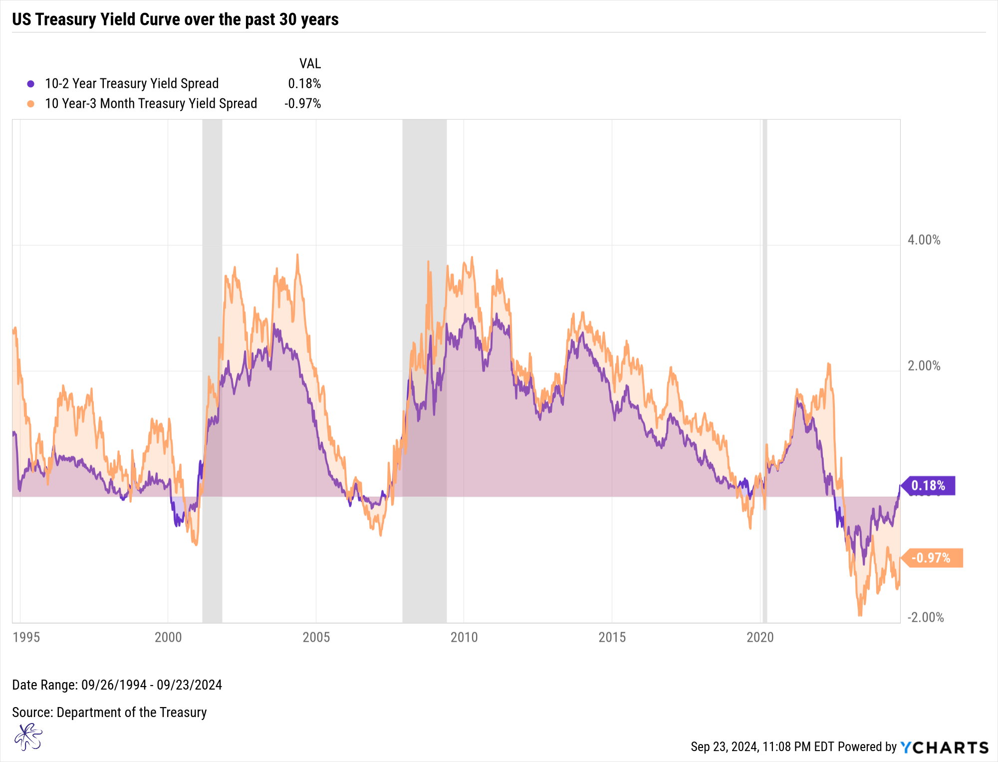
10-Year Minus 2-Year Yield Curve Crossings:
- December 7, 2000
- March 21, 2007
- August 28, 2004
10-Year Minus 3-Month Yield Curve Crossings:
- January 22, 2001
- May 30, 2007
- October 11, 2019
These crossings correspond to three key periods in modern market history:
- The Dot Com Bubble Burst
- The Great Financial Crisis
- The Pandemic Recession
The Dot Com Bubble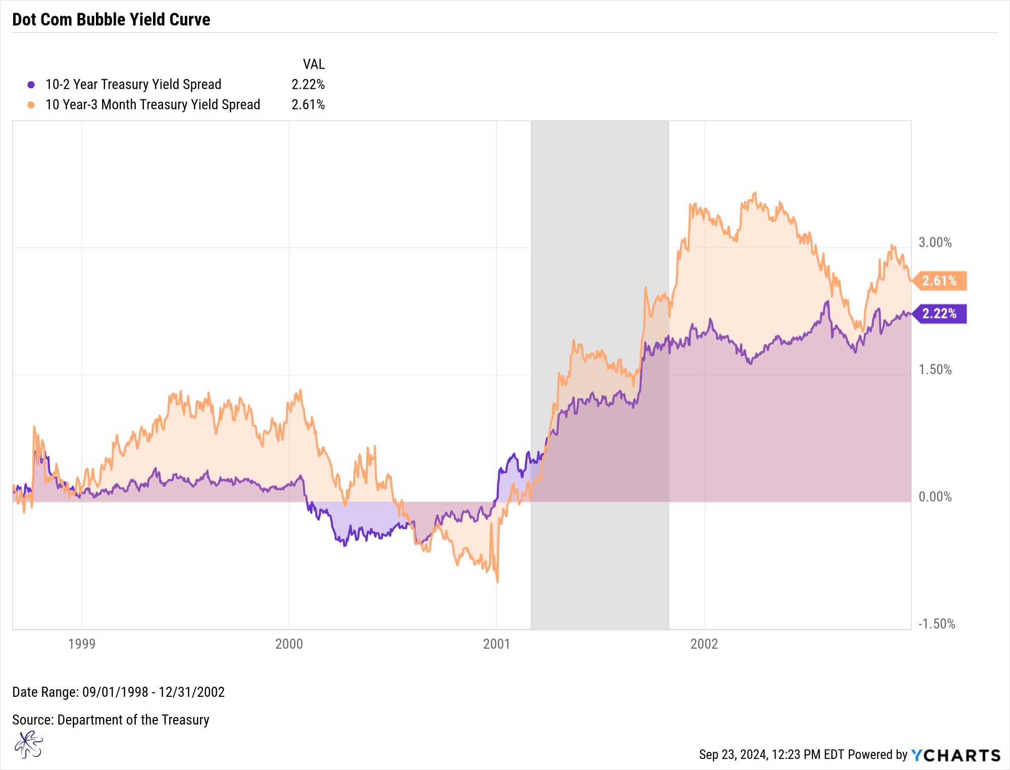
During the Dot Com Bubble, both the 10-year/2-year and the 10-year/3-month yield curves crossed back into positive territory well before the recession hit. Interestingly, the 10-year/2-year curve led the 10-year/3-month curve in both inversion and reversion.
The Dot Com Bubble recession did not officially occur until March of 2001. This was 2 to 3 months after the yield curves steepened into positive territory.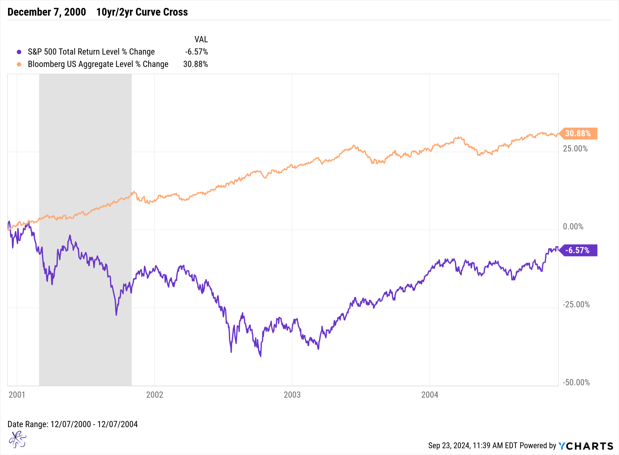
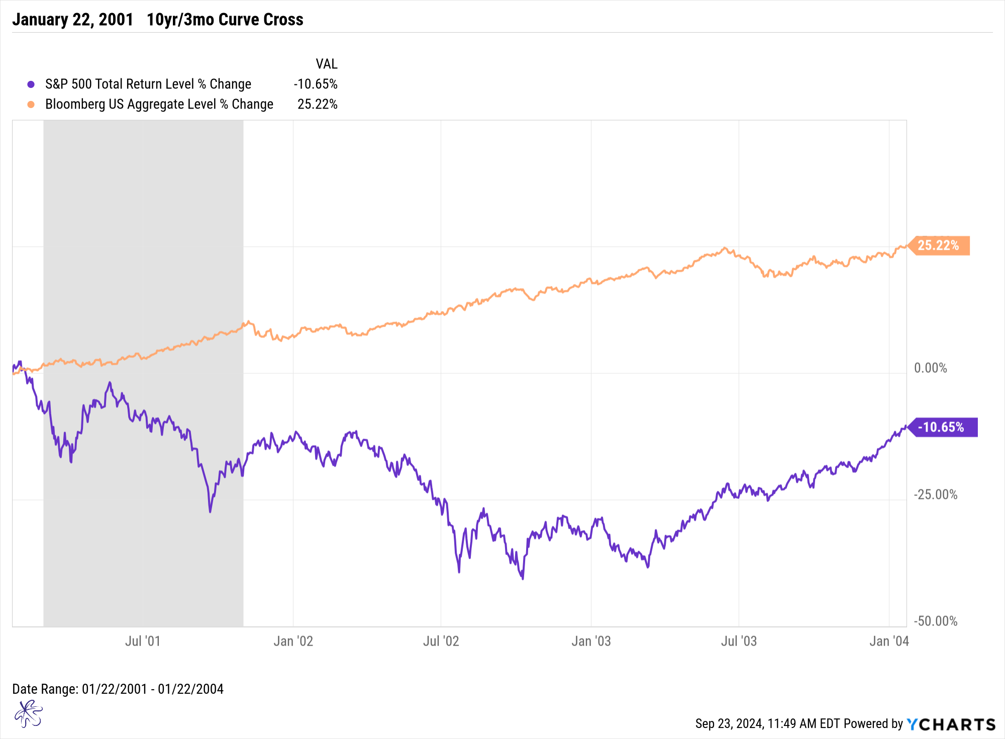
Looking at market returns from the date that each of the respective yield curves moved from negative back to positive slope, bonds outperformed equities by a wide margin. While the equity markets experienced double-digit losses, the bond market provided double-digit gains over the next three years.
Both curves provided similar insights, with reversion occurring ahead of the recession, and both showing that bonds became the safer bet. This highlights the importance of paying attention to yield curve movements.
The Great Financial Crisis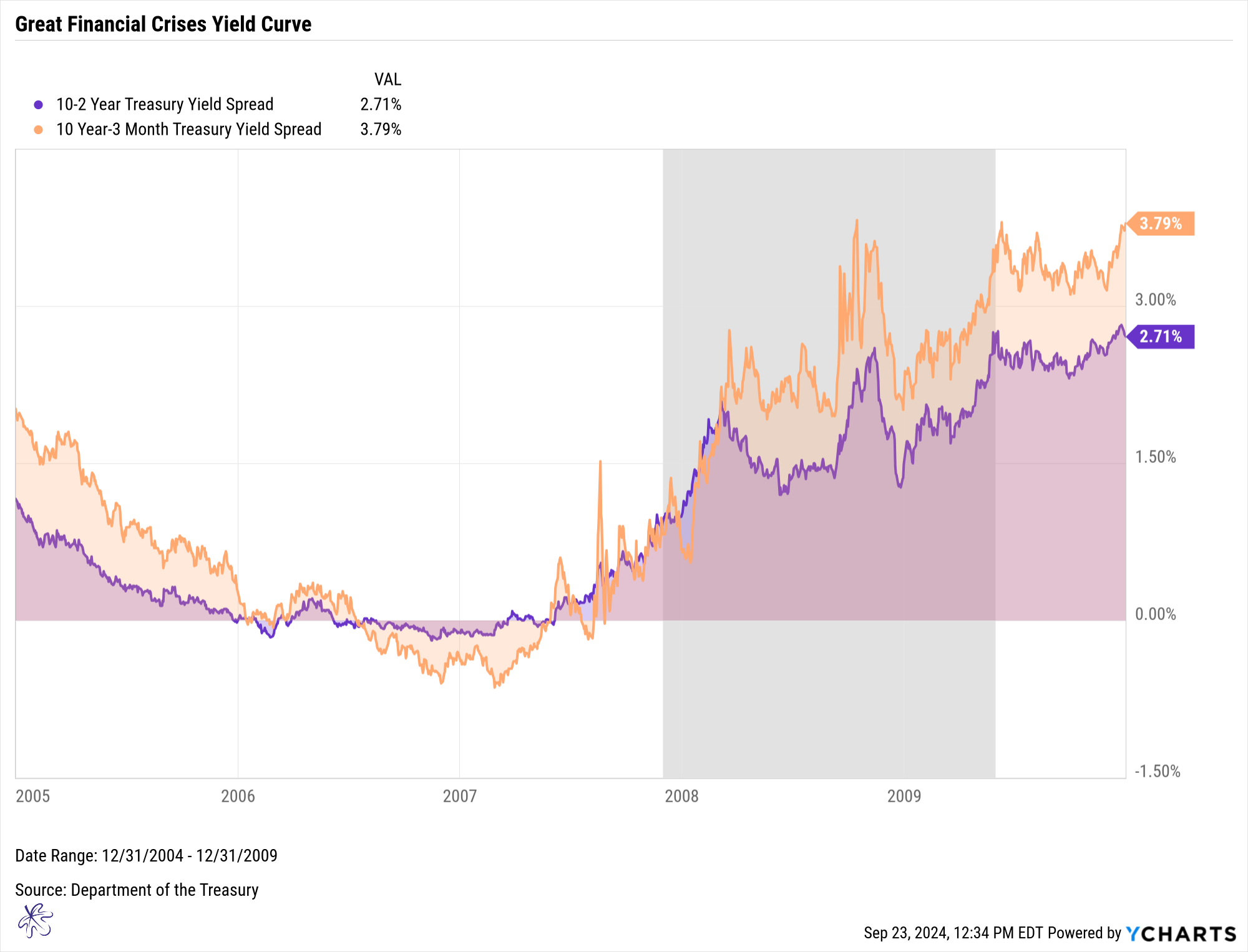
Things were more complex during the Great Financial Crisis. The 10-year/3-month curve inverted more deeply than the 10-year/2-year curve, and the latter reverted back to a positive slope nearly two months earlier, in March 2007.
The Great Financial Crisis recession did not officially start until December of 2007. The curves returned to positive territory 7 to 9 months prior to the actual recession beginning.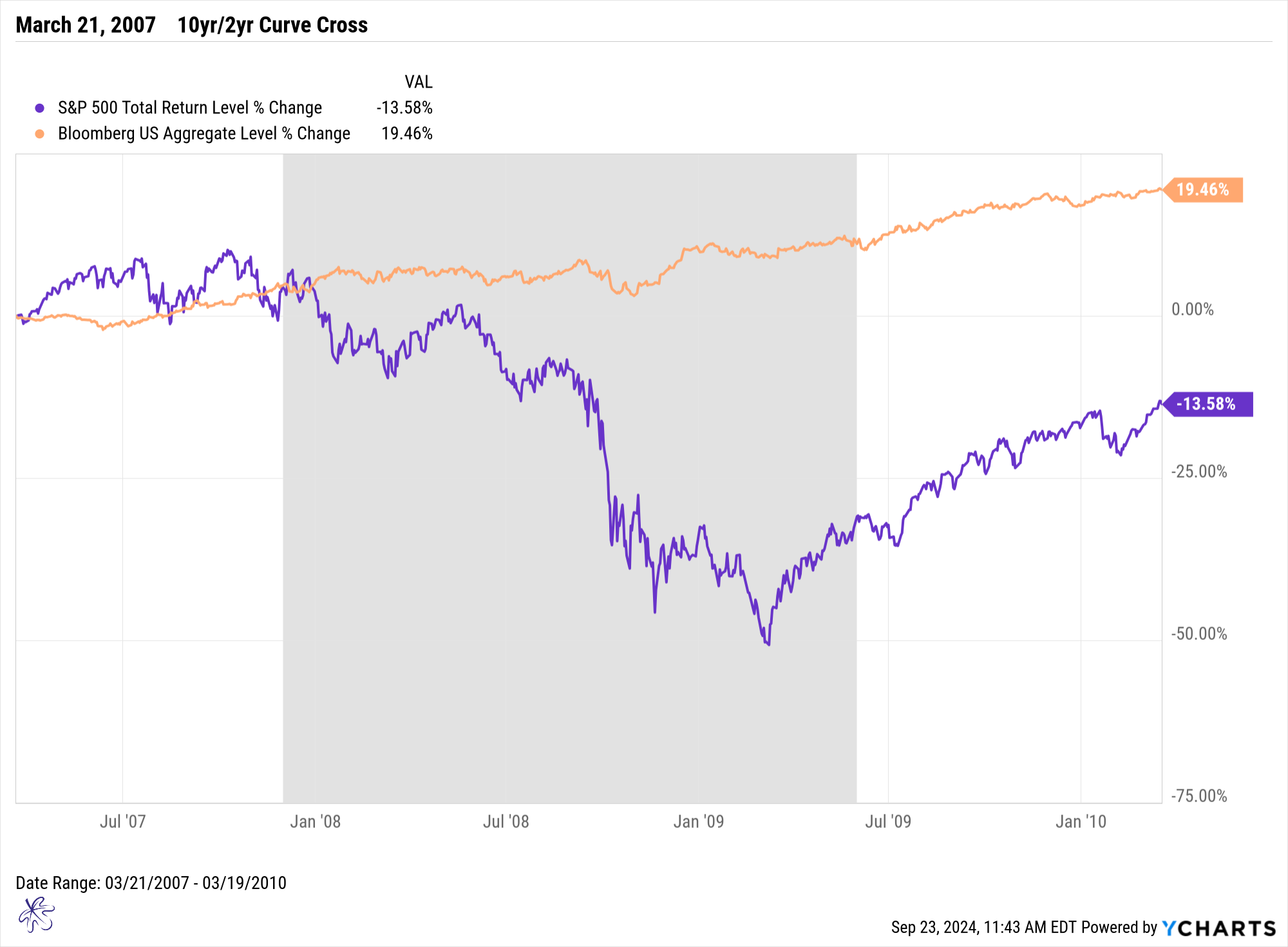
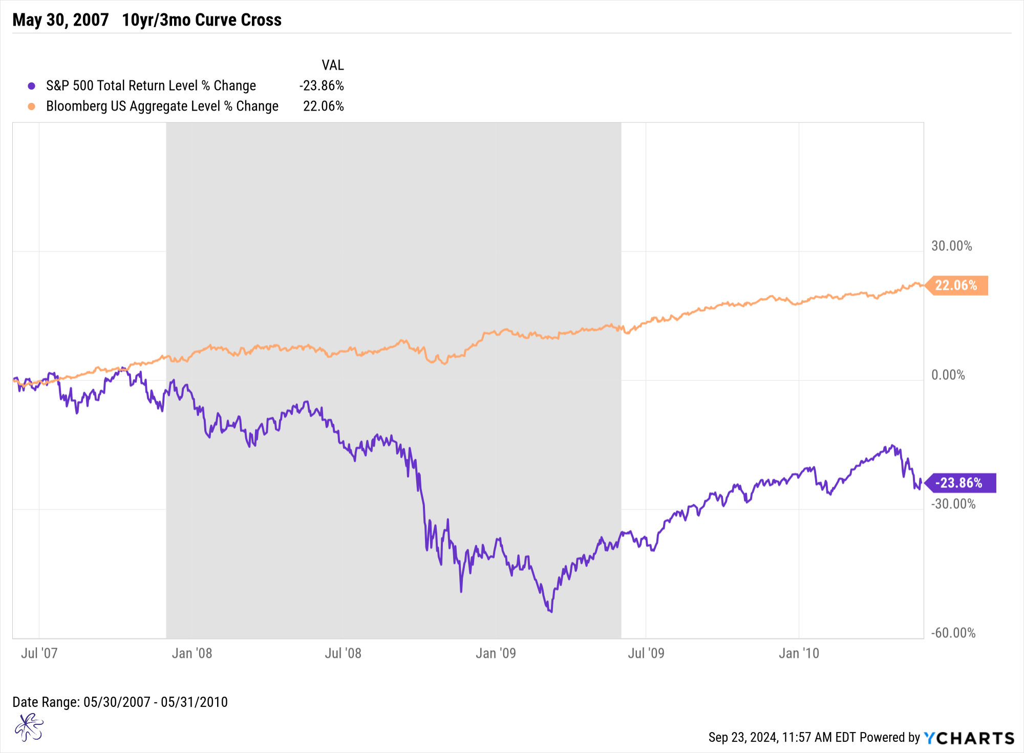
This two-month gap between when each of the respective curve reversions had a significant impact on market returns. From March to May 2007, the indices continued to post gains, but after the 10-year/3-month curve returned to a positive slope in May 2007, the market began to flatten. By January 2008, the equity markets began a sharp decline, with losses that exceeded 50% at their worst.
Once again, bonds performed better. Over the same three-year period, the bond market offered stable returns, while equities suffered severe drawdowns.
The Pandemic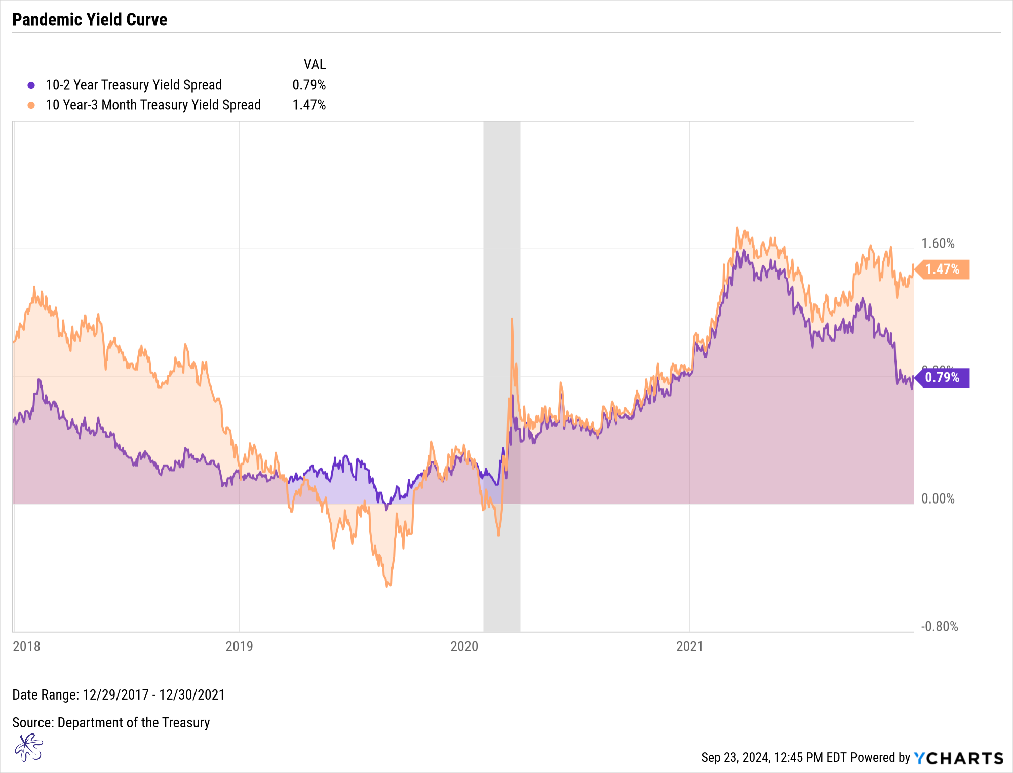
The pandemic recession provided yet another twist. While the 10yr/2yr yield curve inverted, it was only for a matter of days. In this case we would hardly consider this an inversion. On the other hand, the 10-year/3-month curve inverted for months during 2019. The 10-year/3-month curve steepened into positive territory on October 11, 2019. This was about four and a half months prior to the recession officially starting in February of 2020.
Unlike the previous recessions, the equity markets initially posted strong gains after the reversion, eventually selling off in February 2020.
The pundits who focused on the 10-year/2-year curve wrongly stated that this otherwise reliable recession indicator had missed the Pandemic recession. Many failed to notice the 10-year/3-month curve inversion, which is often considered the more reliable indicator by the Federal Reserve Bank of New York (Yield Curve as a Leading Indicator).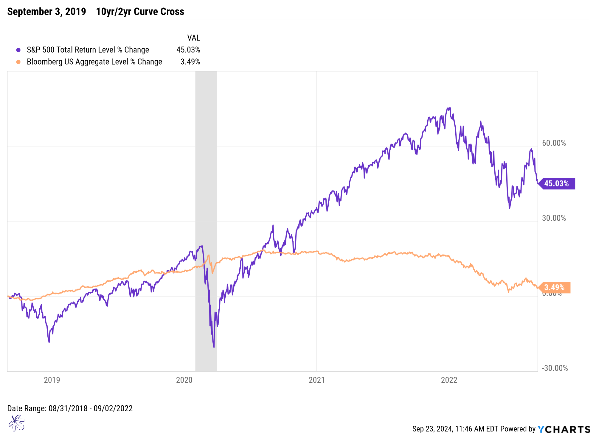
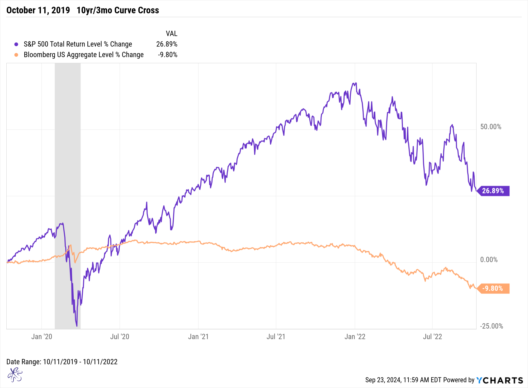
The pandemic bear market was one of the fastest sell offs in modern history. However, the FOMC intervened, providing unprecedented support that helped stabilize the markets and economy. The result was a much quicker recovery compared to the Dot Com Bubble and the Great Financial Crisis. Still, the bond market remained more stable, avoiding negative territory until the 2022 bond bear market.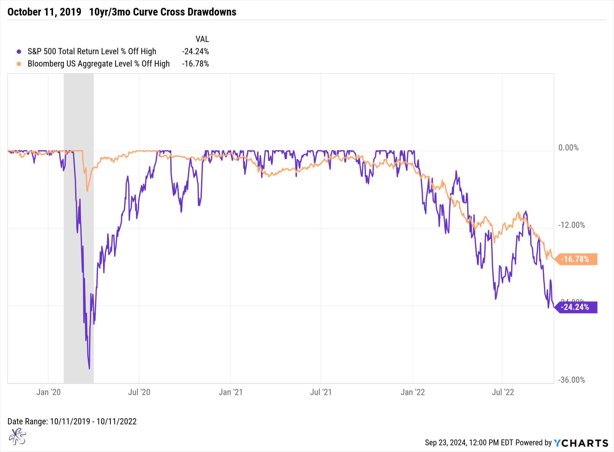
By 2022, both equity and bond markets experienced extreme volatility. During this period, the S&P 500 experienced two major drops of more than 20%, with a peak drawdown of over 30% during the pandemic.
Key Takeaways from Historical Yield Curve Crossings
On January 9, 2008, Richard Fisher of the Dallas Fed said:
"While there are tales of woe, none of the 30 CEOs to whom I talked, outside of housing, see the economy trending in negative territory. They see slower growth. Some of them see much slower growth. None of them at this juncture, the cover of Newsweek notwithstanding, a great contra-indicator, which by the way shows ‘the road to a recession’ on the issue that is about to come out, see us going into a recession." (The Fed’s Actions in 2008: What the Transcripts Reveal - The New York Times (nytimes.com))
This shows that rarely does anyone in power openly predict a recession, even when the signals are flashing. In fact, the U.S. economy turned out to be in a recession during January of 2008, when this statement was made. We can’t rely on official proclamations, but we can use historical patterns to guide our decisions. Here are the key conclusions:
Actionable Insights:
1. History Is Repeating Itself: This time is not different, yet. The current yield curve behavior mirrors the last three recessions. However, many investors may fall prey to recency bias, assuming that recent market highs and the Fed’s current policies will prevent significant downturns. The real market stress often begins after both the 10-year/2-year and 10-year/3-month yield curves have steepened back to a positive slope. Today, only the 10-year/2-year is positive, while the 10-year/3-month remains inverted by 97 basis points.
2. A Soft Landing Is Far from Guaranteed: In all three previous scenarios, the market experienced drawdowns of more than 30% from the peaks. It took many years for the market to recover in two of the three cases.
3. Expect Increased Volatility: While equity markets may continue to hit new highs, history suggests we should expect heightened volatility after yield curve reversions. Investors who focus on historic patterns, rather than succumbing to the comforting narratives of a soft landing, can make more informed decisions. Bonds may offer a better risk/reward profile at this stage, so it might be wise to reconsider portfolio allocations. While bonds may traditionally be thought of as a conservative investment, they may just be an opportunistic investment in today’s market environment.
Overcoming recency bias is critical to building a resilient market mindset. By understanding historical patterns and avoiding the temptation to believe "this time is different," you can prepare for the potential risks ahead. Rather than chasing recent market highs, now is the time to make thoughtful adjustments to your portfolio, helping ensure it is positioned to weather the potential volatility that history has shown often follows yield curve reversions.
This coming Thursday, we will go deeper into the behavior of different equity market sectors during these periods of volatility. We’ll explore whether certain sectors perform better in turbulent markets, helping you identify potential opportunities.
Not only will we be publishing our regular Thursday blog, but we will be hosting our live market update at 11:30am EDT with Q&A. Please use the link below to register:
Register for the SYKON Market Update
